CAP Rebrands
The Civil Air Patrol (CAP) launched a rebranding effort, including an all-new logo that is decided futuristic while still being symbolic of the organization’s position within the Air Force family,…
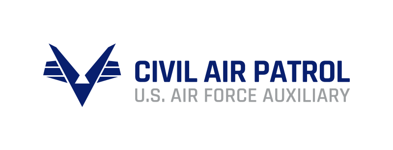
The Civil Air Patrol (CAP) launched a rebranding effort, including an all-new logo that is decided futuristic while still being symbolic of the organization's position within the Air Force family, its mission and, yes, its history. CAP's Board of Governors voted unanimously April 23 to adopt the new logo, which "accomplishes several things and includes some unique benefits," said Randy Bolinger, chief of marketing and communications. "The bottom line is, we are not the Civil Air Patrol of the 1940s, and the new corporate identity makes that obvious," Bolinger said. The V-shaped logo combines nods to the CAP's unique position as a national youth initiative that has aviation as its heart. It also, if you know where to look, references the CAP's spirit of volunteerism and partnership with the Air Force as a Total Force partner.

Subscribe to Our Newsletter
Get the latest Plane & Pilot Magazine stories delivered directly to your inbox

